
Maybe some of you are wondering "How does Pat choose what color to pick?", I mean, there are soooo many! Well, I'm constantly keeping up to date with fashion runways, editorials and campaigns and there's always "those" colors that just stick in my head. And of course, I'd love to share some of those images with you so you can also see that you can make beautiful, bold fashion statements by only using one color! The right color, that is ;)
These are some Pure Elements colors I've come up with lately... what do you think? getting any creative ideas to renew your wardrobe?
 This is APRICOT CREPE, a soft creamy tone of orange that is sooo light for spring and summer!
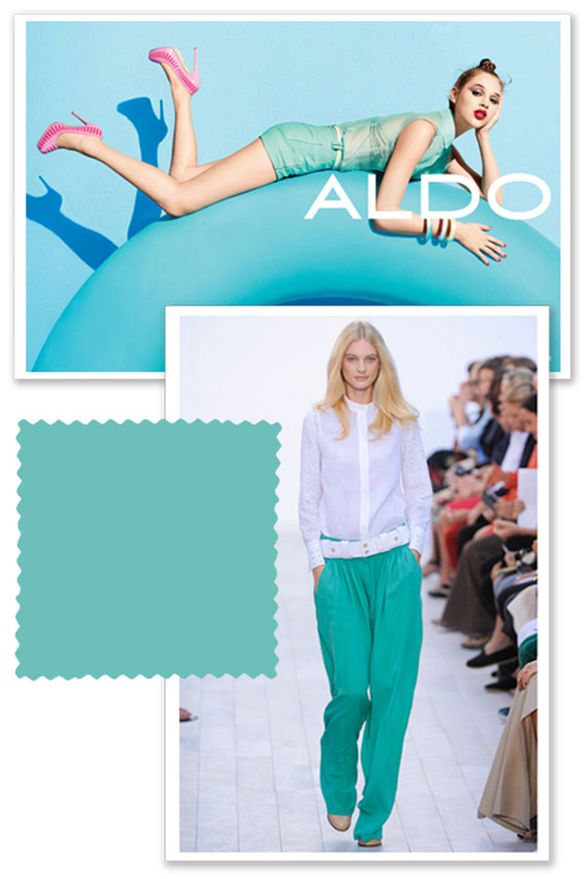

A great neutral: SANDSTONE is that gorgeous safari pastel tone that is so in right now.
 MOONSTONE is a super dark shade of gray for the ones that don't wanna wear black and still wanna look chic.

 I've been seeing navy blue all over the place lately, so modern and so elegant; this is NOCTURNAL.
 So how are you linking these new colors?? Think of other ways to apply them to your wardrobe or home??
Love, Pat
Probablemente la mayoría de ustedes ya están familiarizados con nuestros sólidos, Pure Elements. Nos encontramos con nuevos colores con cada nueva colección se inicia, por lo que siempre tienen ese tono exacto que está buscando.
Tal vez algunos de ustedes se preguntan "¿Cómo Pat elegir qué color elegir?", Quiero decir, hay soooo muchos! Bueno, yo estoy constantemente mantenerse al día con las pasarelas de moda, editoriales y campañas y siempre hay "esos" colores que sólo se pegan en la cabeza. Y, por supuesto, me gustaría compartir algunas de esas imágenes con usted para que usted también puede ver que se puede hacer declaraciones bonitas, la moda audaces utilizando sólo un color! El color correcto, que es ;)
Estos son los nuevos colores puros elementos que vienen con ... ¿qué te parece? obtener ideas creativas?
Esto es Crepe de albaricoque, un tono suave y cremosa de color naranja que es taaan luz para la primavera y el verano!
Y porque nunca me canso de blues, aquí está Mirage azul, que se ve muy bien emparejado con blanco, por lo fluidas y veraniego!
UN GRAN neutral: La arenisca es esa hermosa safari tono pastel que es así en estos momentos.
Moonstone es un tono súper oscuro de gris para los que no quieren vestir de negro y todavía quiero lucir chic.
Sé que este color puede ser bastante intimidante debido a su intensidad, y es muy raro ... pero ¿no es maravilloso? ¿Te atreves a poner?
Gris Mystic es un tono suave, la luz que debería estar en "pila básica" de todos.
He estado viendo el azul marino por todos lados últimamente, tan moderno y tan elegante, lo que es nocturna.
Entonces, ¿cómo va a vincular estos nuevos colores? Piense en otras formas de aplicarlos a su guardarropa o en el hogar?
Volveremos con más ideas inspiradoras y por supuesto, más y más colores!
No comments:
Post a Comment